Hay Day Store Redesign
A Portrait-Mode glow up UI/UX challenge.

Hay Day Store Redesign
A Portrait-Mode glow up UI/UX challenge.
Project Context
This project explores a redesign of Hay Day's in-game store, originally built for landscape orientation, and reimagines it as a portrait mode experience. The goal was to translate a familiar, long-standing interface into a vertical format while preserving the game's warm, cozy identity and the sense of familiarity players associate with the Hay Day world.
Designing for portrait required more than adapting the existing layout. The store needed to feel naturally structured for one handed use, with clear hierarchy and pacing across multiple content types, including coins, diamonds, daily rewards, and special offers, without overwhelming the player.
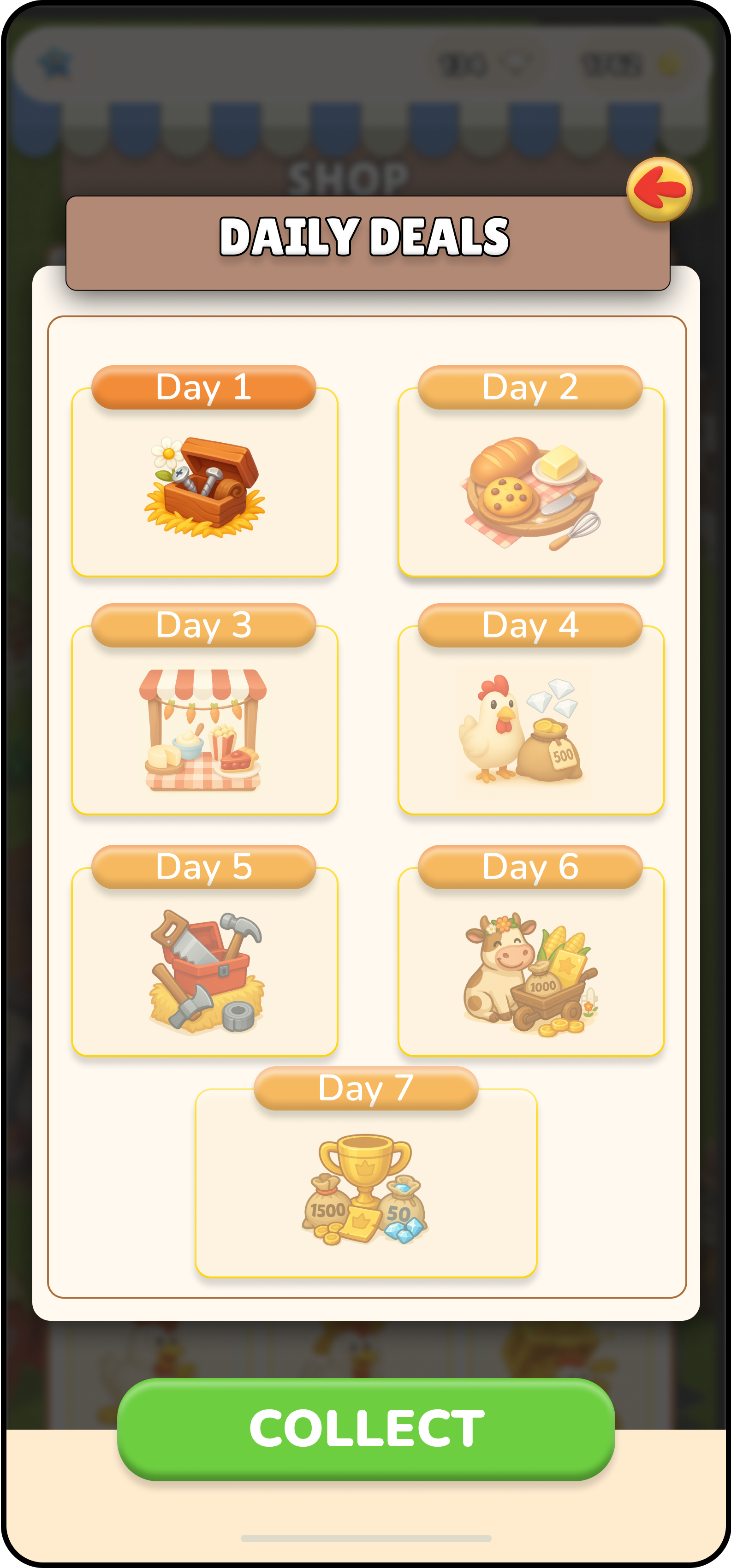
In addition to the shop layout itself, I designed a complete diamond purchase flow, mapping the full journey from pack selection to confirmation and fallback states. A dedicated Daily Reward experience was explored as part of the wider shop ecosystem, designed as a recurring login moment that adds delight and variety while remaining visually connected to the store rather than positioned as a monetized offer.
Across the project, I focused on clarity and polish at every level, from interaction flow to visual systems. This included creating custom icons, defining a consistent typography hierarchy, and refreshing UI components to support a scalable, readable, and emotionally coherent store experience in portrait mode.